Thursday 29 November 2007

Week 9: Lighting Sam's Scene

Here are some more shots of lighting I have done, this time I have worked on Sam's scene and try to simulate the same lighting effects. obviously this was a little different as the environment is much larger and the illumination needs to cover a bigger area. But we managed to get some interesting shadows and some nice dramatic lighting here.

Wednesday 28 November 2007

Week 9: Project Summary

Well the end is nigh! Finally there after many weeks of stress, sweat and tears! Can't say how glad I am at how this has all come together, especially these last couple of weeks. Really thankful to the other guys in the group for helping me out while I've juggled my Uni work, weekend job and my work experience at the Sci Fi Channel.

So yeah it's all come together at the right time and although the production schedule seemed to be slipping through the texturing phase it seems we have made up plenty of time through the lighting and rendering where extra hands have been available after completing their other tasks. Everyone's attitude has really been outstanding to pull together and come in with the work on time despite some errors with rendering and difficult with dodgy scenes! Think everyone should be proud that we all have a very quality piece of work to present on our showreels and promote our wicked 3D skills!

Also think we have all learnt a great deal in terms of Maya and some new skills that are gonna benefit us in later projects, particularly with modeling and texturing.

Overall - great success!

Harvey

Tuesday 20 November 2007

Week 8: Lighting Jeff's Environment

After completing my section ready for renders I've started work on Jeff's lighting to get it the same throughout the piece. or at least a similar style so it all seems to flow like its the same place. Here are some of the lighting effects I've put on his street, again I've used lens flare and spotlights to create some nice shadows casting down the floor.


Also I worked on some of the textures on the old lady. I did some simple mapping on the clothes and also found anew texture for the head scarf which I put a bump map on to try and give it more detail and depth.

Week 8: nCloth on Flag

Also to add a new dimension and a new skill shown in the environment I got Sam to show me how to do some basic cloth dynamics. I've made a Spanish flag in the main street and got a slight breeze blowing on it. Should be a subtle bit of animation in our otherwise desolate environment.

Week 8: Lighting

Okay so finished off some last little tweaks on the texturing this week and then moved onto lighting my scene. I've been in charge of experimenting with the lighting and I'll duplicate similar effects in everyone elses envrionment sections so that everything remains generic and flows.

The style I have used has tried to make the lighting really intensifying and generally making the streets seem incredibly hot. Ive put a sphere around the environment and and put a big glow on this to basically wrap around all thwe edges of the geometry joining to the sky.
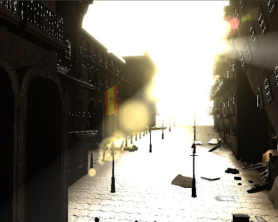
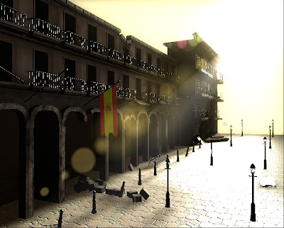
On the other lights ive used mainly spot lights to cast some long shadows and catch specular. Also from these I've experimented with some lens flare. This has a slight yellow/orange tinge so that it conveys the feeling of heat again.
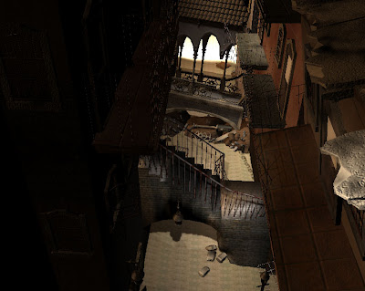
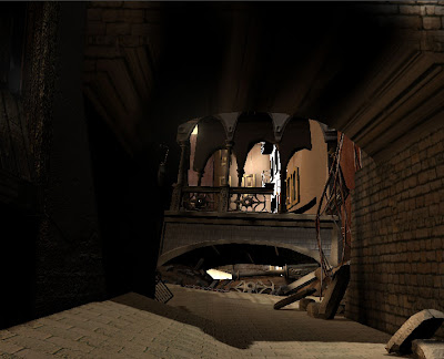
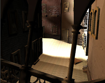
In the alley I've used a series of downlighting spot lights to cast shadows quite intensely and this then contrasts quite well to the streets on wither side of the alley which are really bright. I think the lighting helps to break up the intensity of the whole piece and will clearly show changes in the environment.
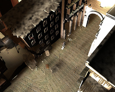
The end section of the street is quite intensely lit also and this leads on nicely to the courtyard. It makes it seem like the cat is 'going towards the light'.
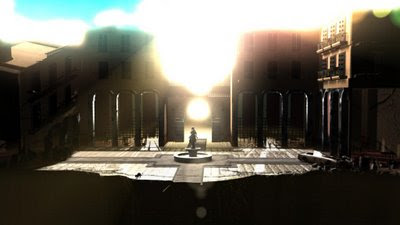
Week 7: Texturing

K the model was complete by this point and here's some of the texturing I've done in my section. Mainly i've used photographic images and then planar mapped them to the planes of the buildings. Seems to have worked well and some good bump maps have really brought out the best in the photos. Obviously will have more impact once lit. Mainly I've kept to photos for the larger planes and for smaller touches I have made my own textures from the Maya defaults.


Also I've tried to work with some specular (blinns and phongs) for any metallic or glass textures so this will bring out the lighting even more aswell as any reflections where elements of the environemtns will be picked up.

Wednesday 31 October 2007

Week 5: Modelling the Main Street

These are some more modelling shots. I have started branching off from the alley onto the main street where the cat will lead onto the courtyard. Here I have had to kind of blend some of my earlier architecture with Sam's more expansive archways and courtyard areas so it flows nicely. Generally I think this is working really well and I will continue to fill the street with more buildings by Monday as this is my production deadline for the modelling part.